UX Design
App Name: Tutors Unlimited
Case Study: Design an app that enable tutors to list their services and parents to search for and book time with tutors.
-
Challenges:
- Enabling professionals to offer tutoring services in various subjects or fields.
- Enabling individuals to easily find tutors anywhere and at anytime.
-
Goals & Objectives
- Enable tutors to easily list their services.
- Allow individuals to search for tutors and book sessions.
- Ensure seamless booking between tutors and individual learners.
RESEARCH
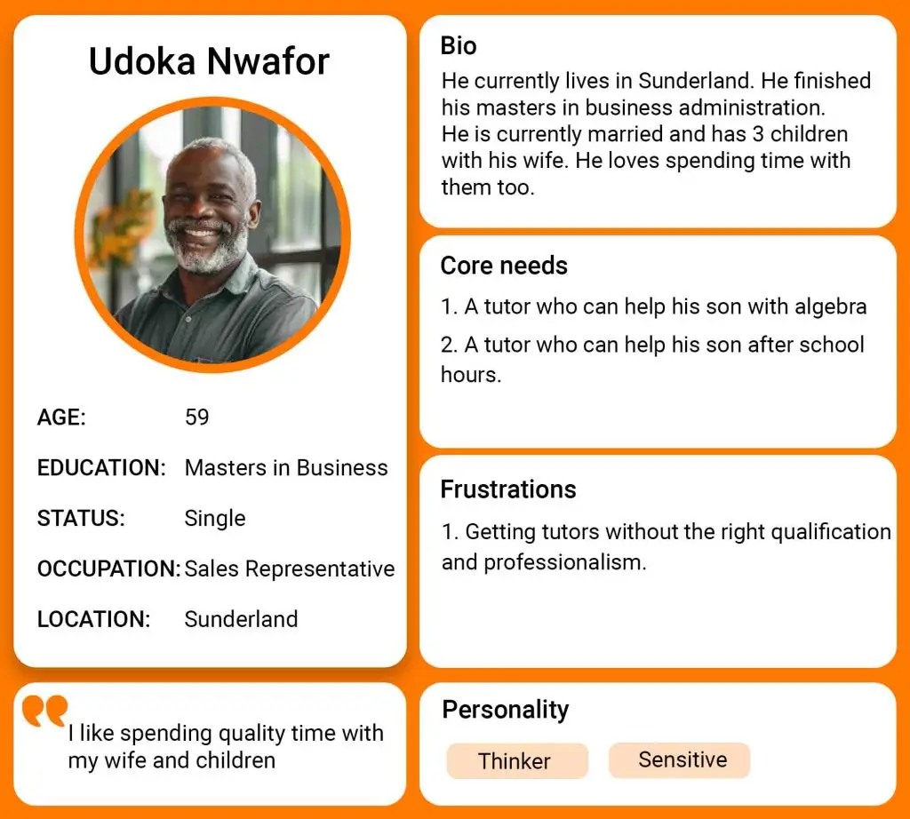
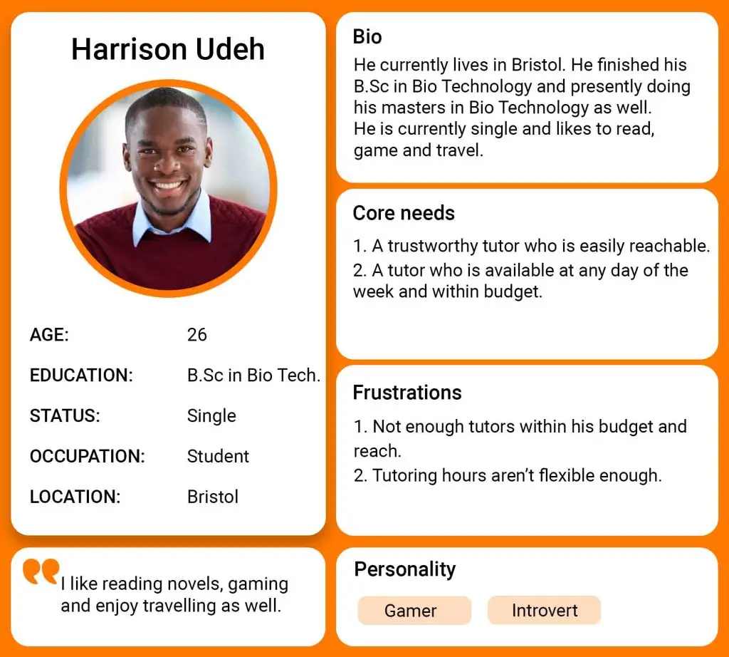
- Interviews: An interview was conducted with individuals to understand their needs, expectations, and pain points.
- Competitive Analysis: I analyzed some existing tutoring platforms like wyzant.com and tutor.com to identify strengths and gaps in their user experience.
- Tutors need an easy way to showcase their qualifications, set availability, and manage booking. Learners needs an easy way to book their tutors while prioritizing on subject expertise, reviews and availability of the tutor.
IDEATION
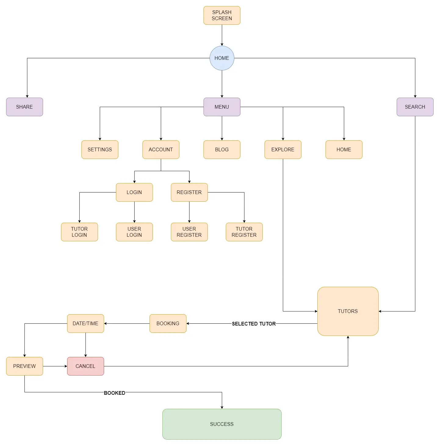
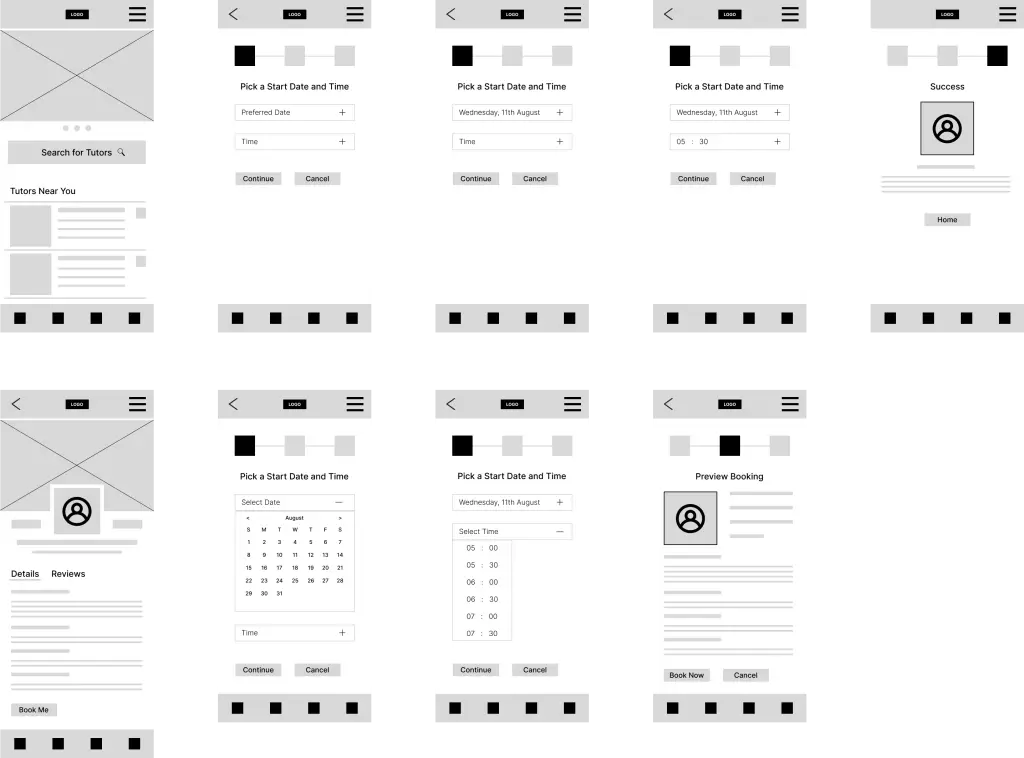
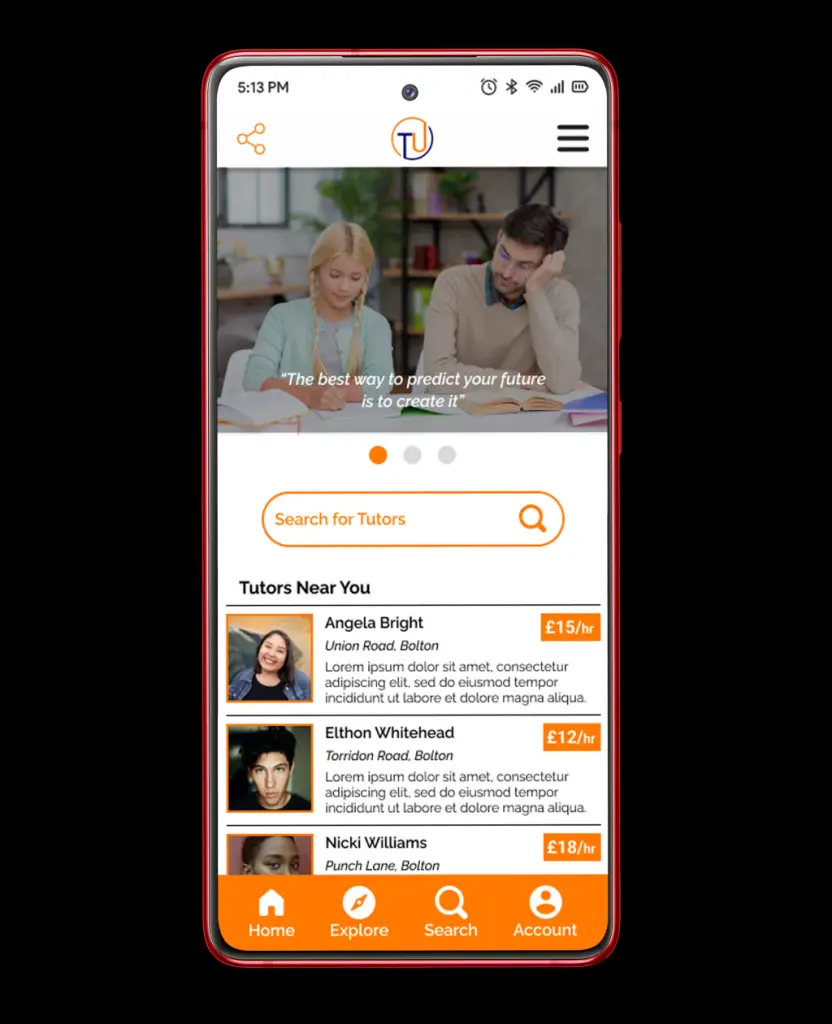
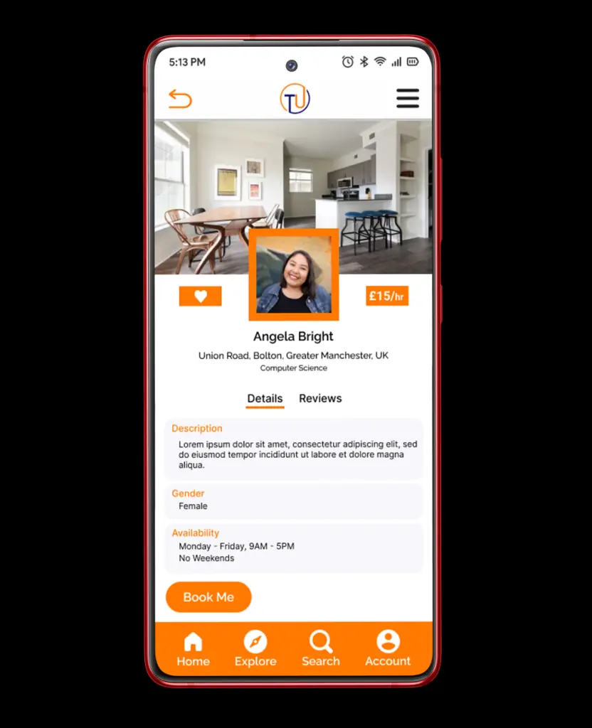
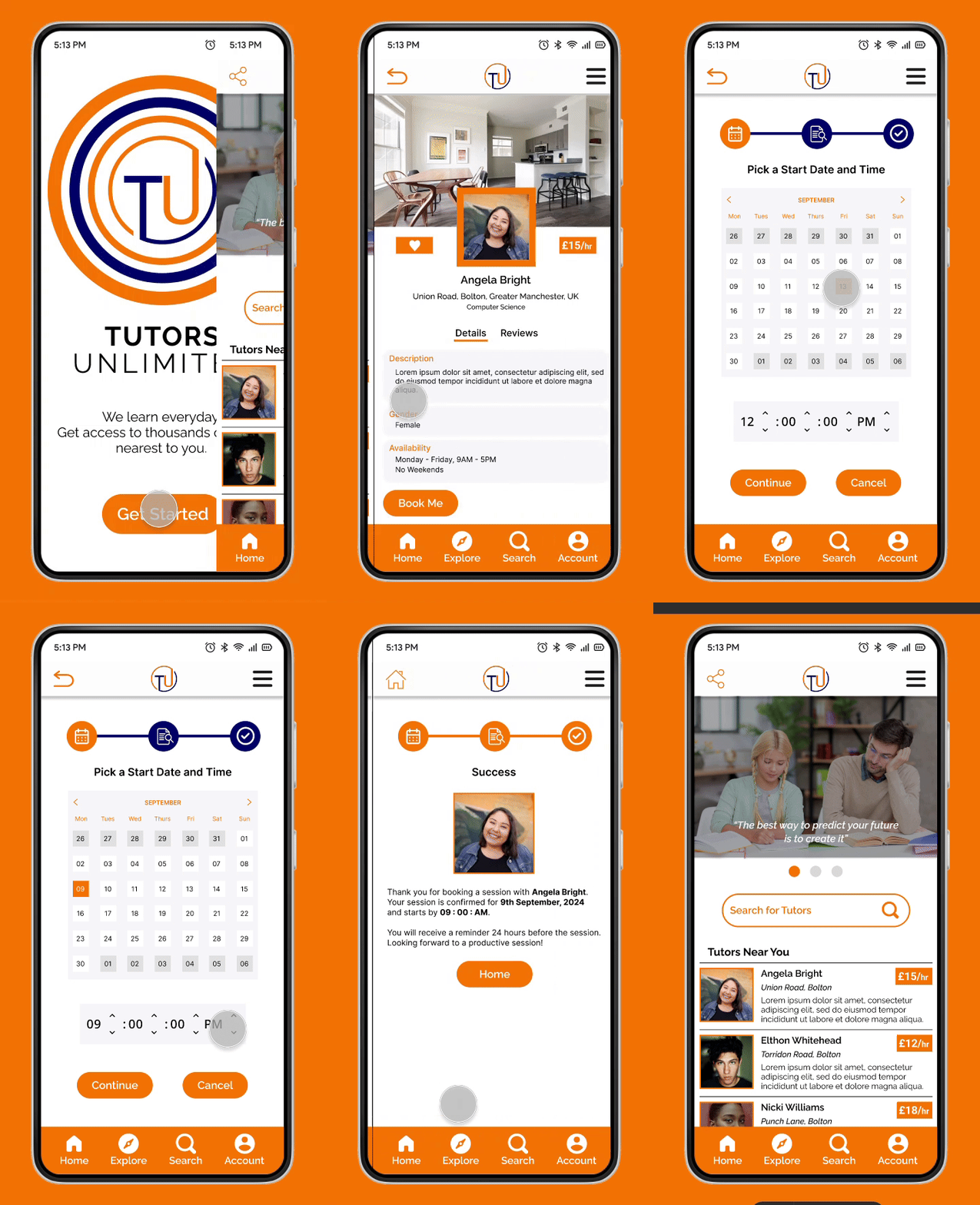
With a location-based search, customers can search for tutors based on location and subject, right from the home page. This can also be achieved via the explore page, where customers can search and filter tutors based on location, subject, gender and pricing. When a tutor is selected, the next screen shows a detailed profile of the tutor. From here, the customer either proceeds with the booking or cancels.
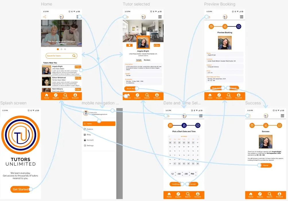
To communicate this concept and strategy, I generated the user flow to communicate the product framework.
I created concept sketches, exploring how to make it easy and understandable, with clear path to the booking process.
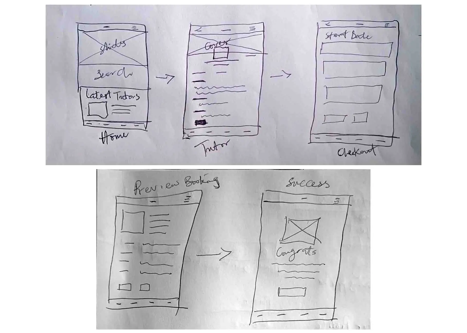
To communicate the concept sketches clearly, I generated the wireframe to help visualize the user flow and navigation.
DESIGN
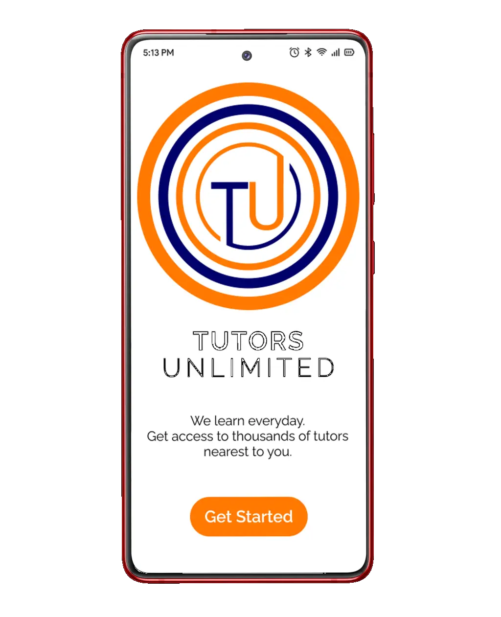
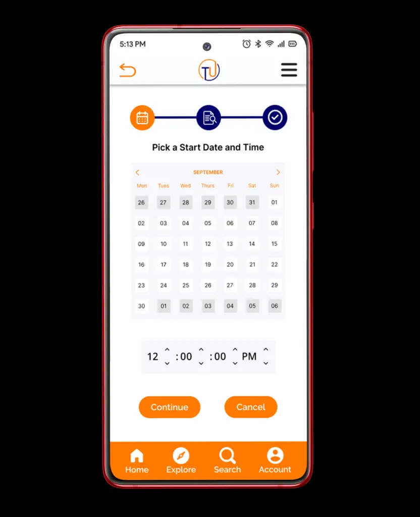
During this phase, I iterated the design based on the Lo-Fi validation findings. The booking process was refined to make it easier for learners to find tutors and make their bookings, right from the home screen without hassles.
VALIDATION
Validation testing was conducted on the interactive prototype with 3 people and the findings are as follows:
- Booking process was seamless and easy.
10/10
- The navigation through pages was clear enough.
9/10
- The interface is very intuitive and simple to understand
9/10
I was happy with the feedbacks gotten from the validation testing. This shows that the user expectations were met and features successfully integrated.
